As the leading pensions company for the local government sector in Sweden, KPA Pension not only manages pensions for almost two million people – but also holds a big responsibility for a better and more sustainable future.
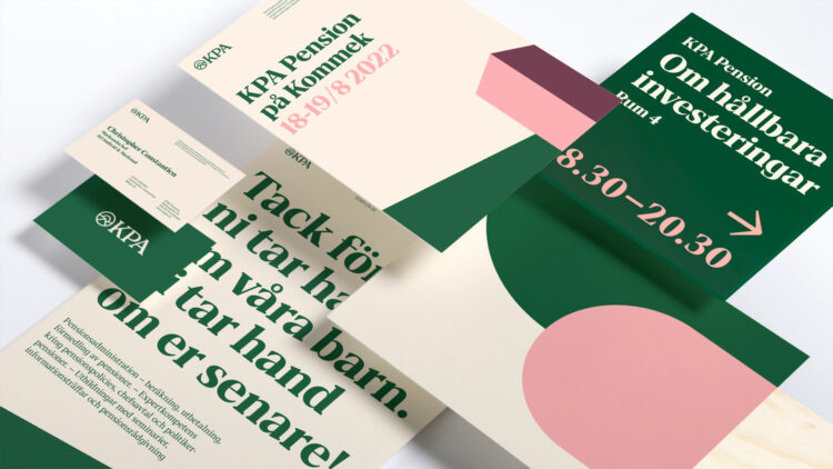
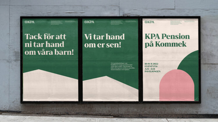
Previous studies had shown that even though the logotype and green color had strong recognition, they neither supported the brand values nor the demands for a functional and modern visual identity. Based on KPA’s values, we wanted the design to convey authenticity, directness and sustainability.
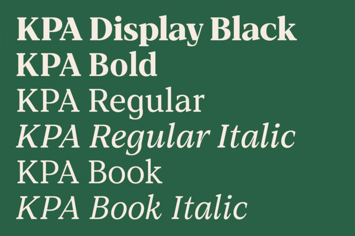
A custom typeface carrying the heritage and legacy for the future. The typeface has the Design DNA and heritage from when KPA Pension was founded in the era of Art Deco, but designed to be modern and functional to handle all the applications and devices out there, 2020 and forward.
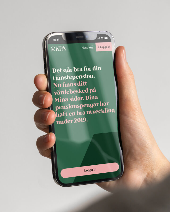
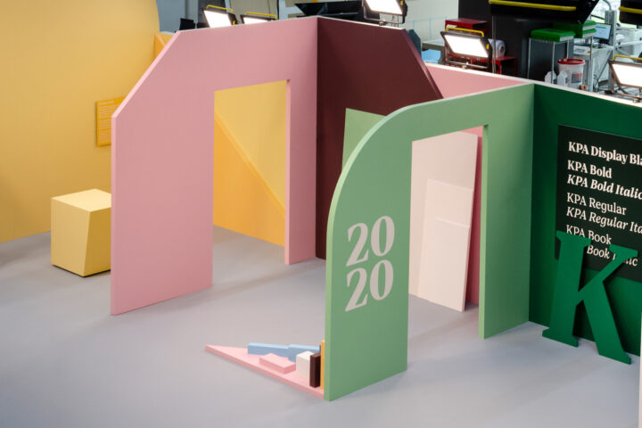
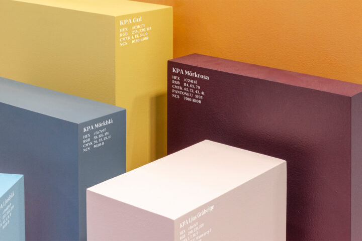
The design strategy established that less is more, and we identified the few important assets that should carry the brand in all touchpoints. A modernised logotype, a new vibrant colour system and a new custom typeface carrying the heritage and legacy for the future. To make even more impact in communication we added big and bold graphic shapes sprung out of the KPA world.